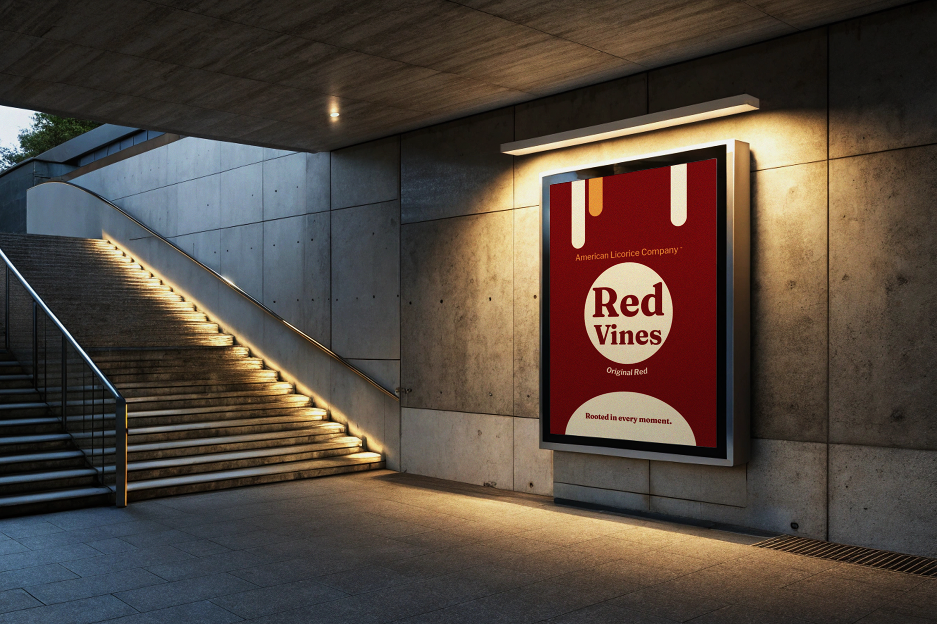
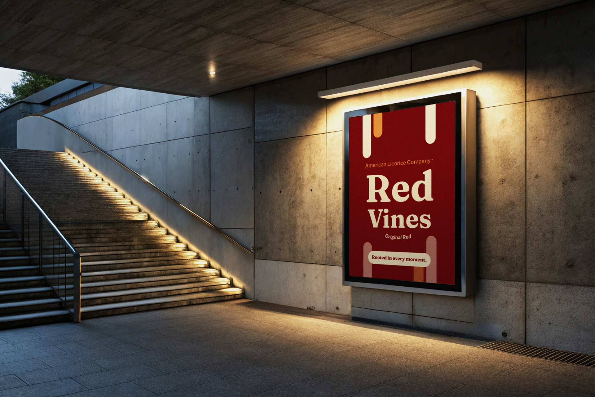
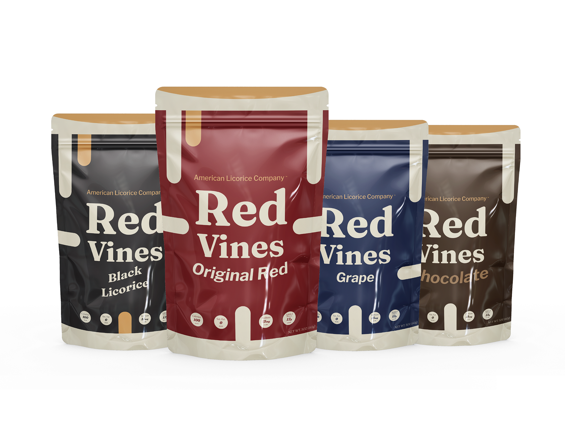
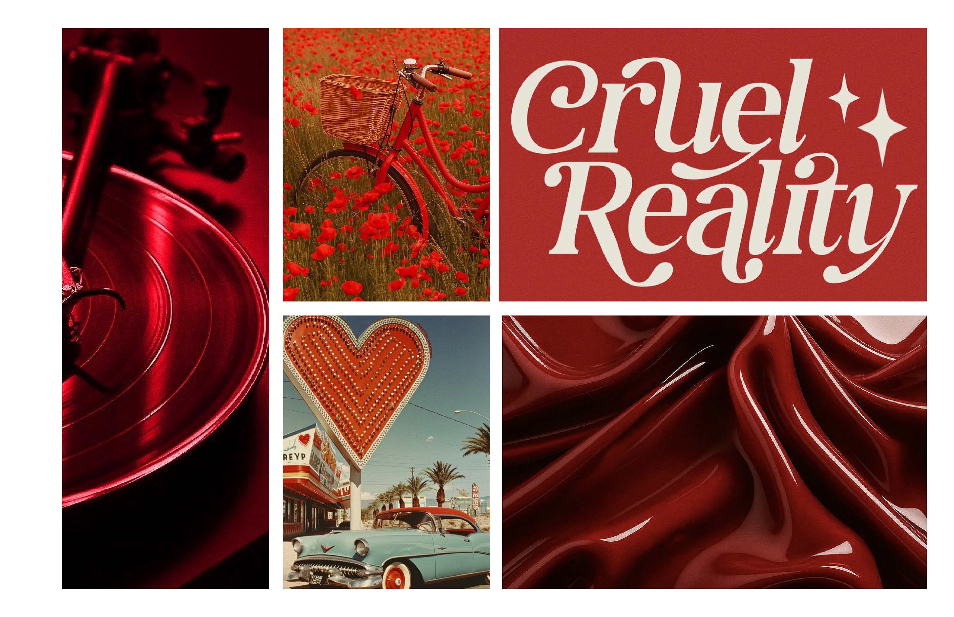
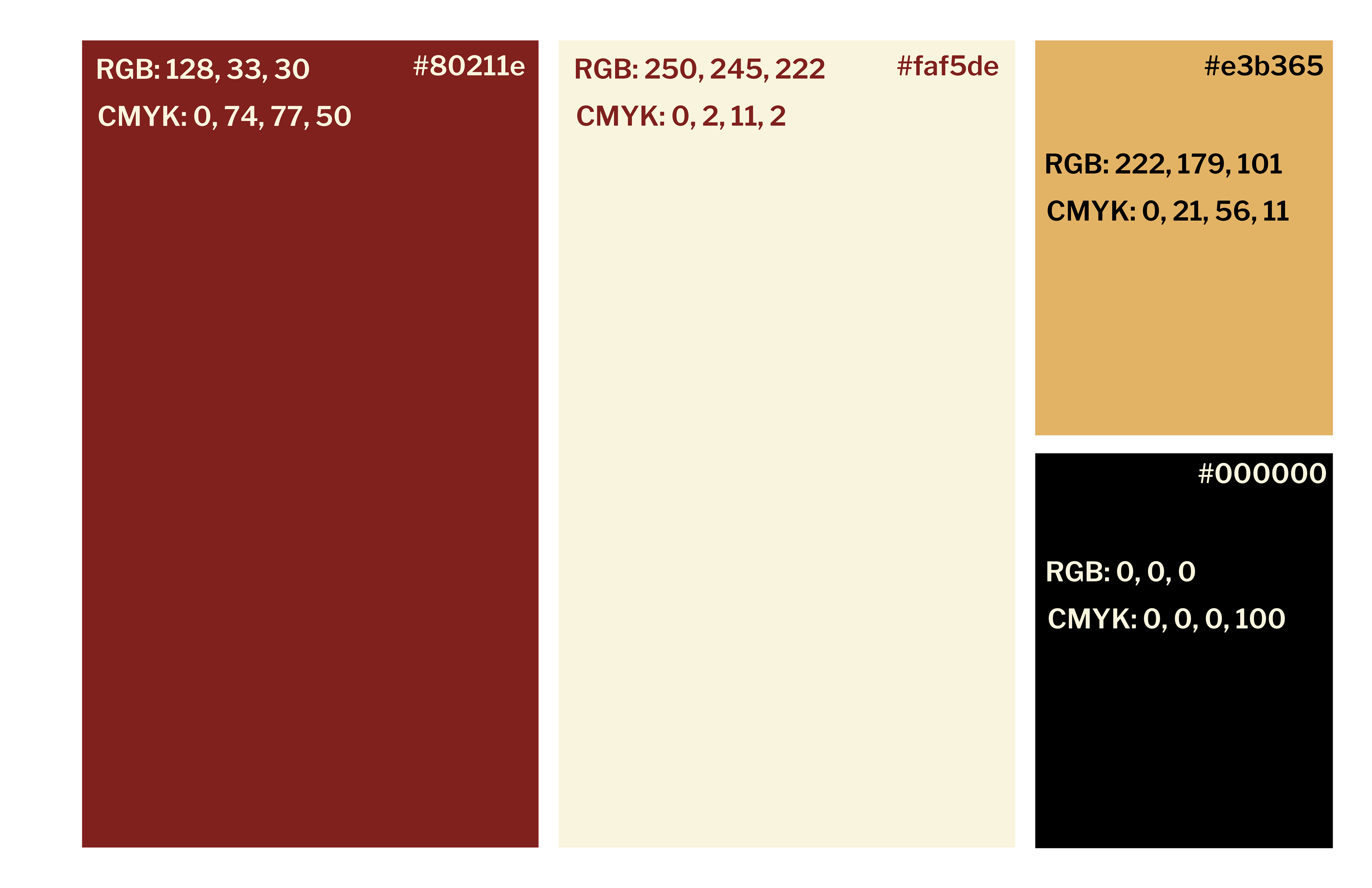
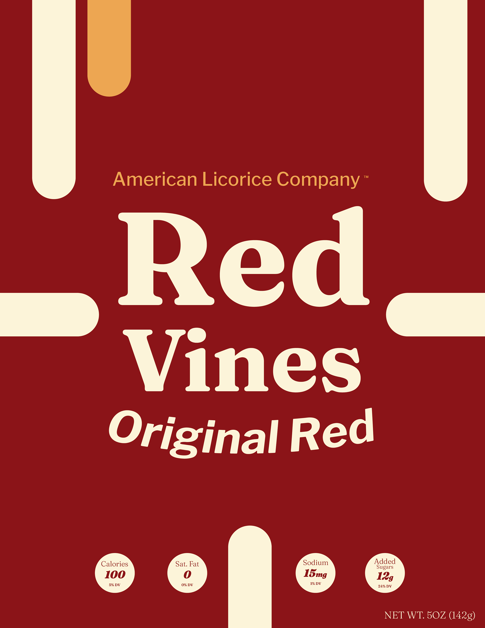
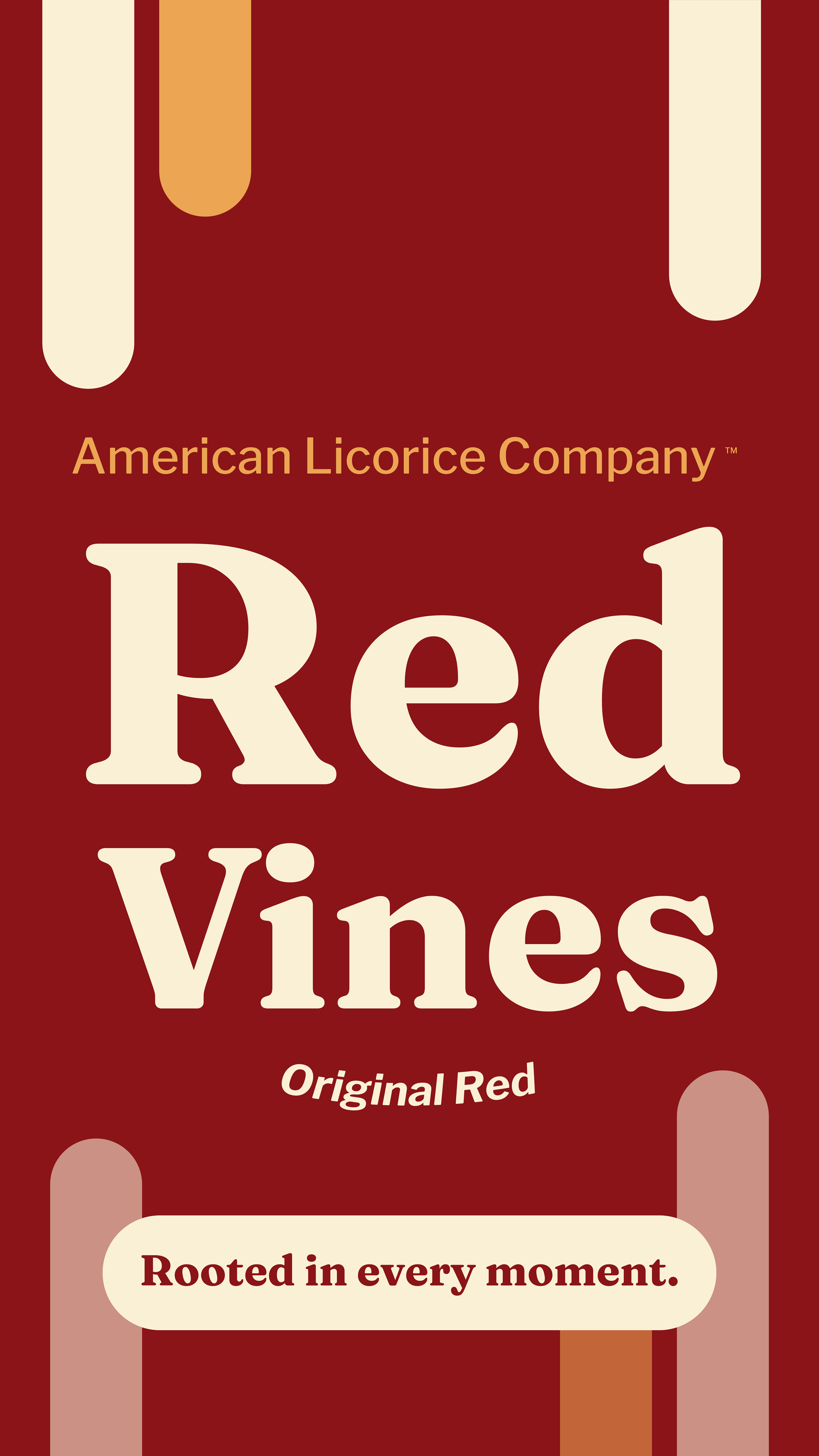
The Red Vines redesign focuses on modernizing the brand while keeping its nostalgic identity intact. Through simplified layouts, bold color blocking, and stronger typography, the packaging was redesigned to stand out more clearly on crowded shelves. The project also introduces a playful dripping graphic system and a consistent flavor-based color palette to create a more recognizable and visually engaging brand experience.
Mockups